
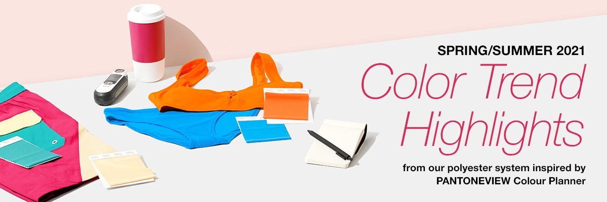
COLOR TREND HIGHLIGHTS SPRING/SUMMER 2021 by PANTONE
Posted by INDINUITY

Inspiration gives us the vigor to create new designs and to work hard to ensure those designs fit within our personal image or vision. It is when we are inspired that we produce the dynamism that reflects our work. Inspiration is the stimulus we need to brainstorm and to plot out new ideas to bring these concepts to life. And it is that creativity which allows us to design things that are fresh, new, bold, and original.
Designing with our Polyester Textile System gives you the ability to stretch your color gamut, balancing bold and bright with neutral and classic. Here is guidance as you start developing your color palettes for Spring/Summer 2021.
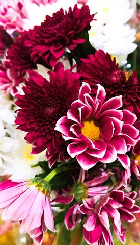
SUMMER BOUQUET
Pale hazy petals combine with exotic pinks and an herbal green to create a fresh summer palette that celebrates the positivity and happiness of colors from nature.
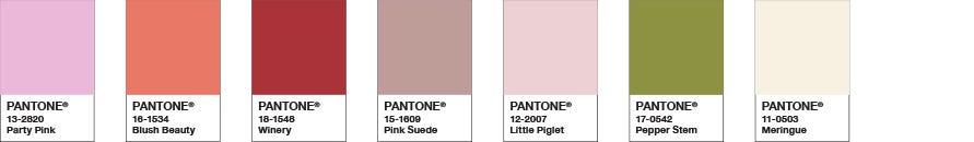
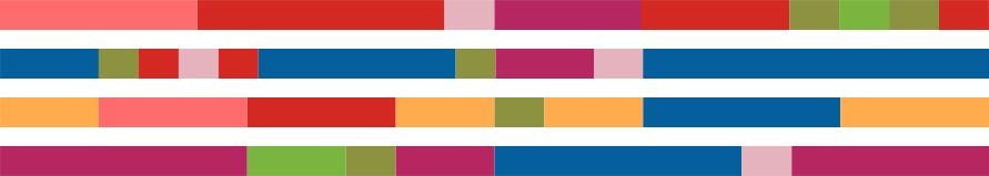
Color Harmonies
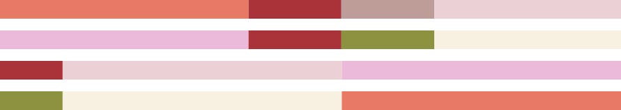
Palette inspired by PANTONEVIEW Colour Planner Spring/Summer 2021
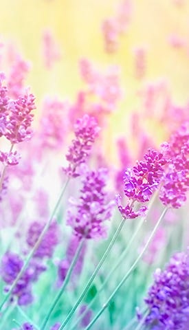
INTOXICATING
A vibrant yellow, sweetly scented lavender, fragrant pink and a cool green combine to create a dynamic contrast with a crisp aqua. A creamy white adds freshness.
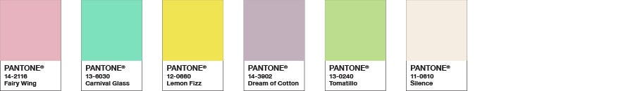
Color Harmonies
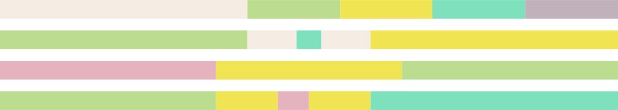
Palette inspired by PANTONEVIEW Colour Planner Spring/Summer 2021
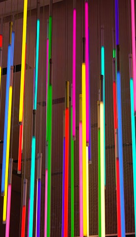
POWER SURGE
A pair of empowering pinks enrich a palette of vibrant brights, infusing glamour to a story of vivid contrasts.
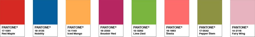
Color Harmonies
Palette inspired by PANTONEVIEW Colour Planner Spring/Summer 2021

